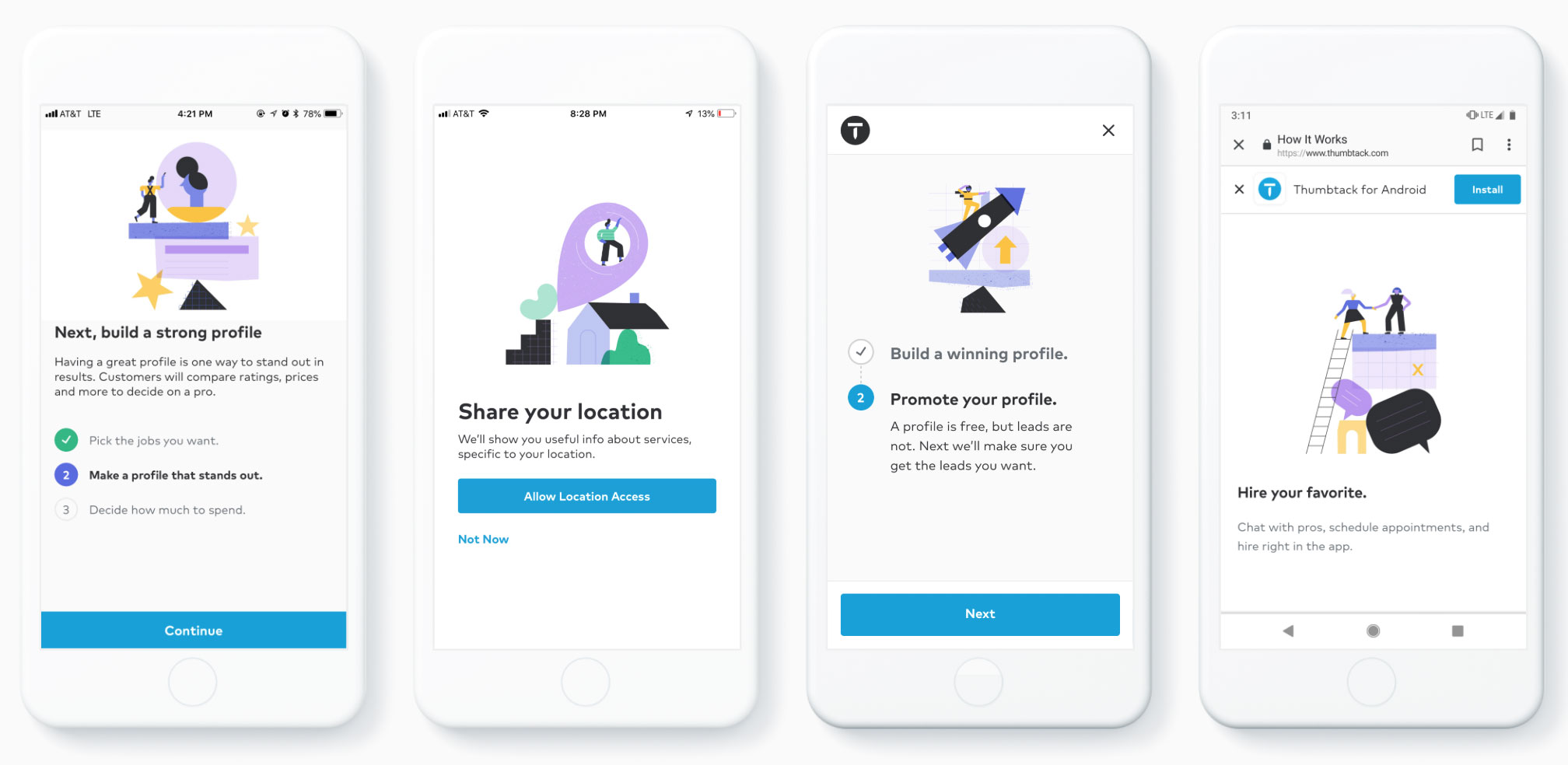
Building a Brand Illustration Style that (finally) Pays Homage to the Gig Economy Workforce
In the winter of 2018, when Thumbtack approached me to strategize and define their illustration style, the mission was to show the power of illustration in a boundless way that could reflect the identity of a company. More than anything, the purpose was to speak clearly and empathetically to the people who use their platform, and scale across product and marketing in a versatile and consistent way.
This called for a month-long design sprint in the Thumbtack San Francisco offices integrated in Thumbtack’s culture and ways. The sprint included milestones around capturing Thumbtack’s mission, creating concepts that would fit in with Thumbtack’s brand values, and of course, a healthy dose of experimentation to lead us to a winning concept and style. I didn’t take this redesign lightly—the previous style had been created by Ryan Putnam, an absolute heavyweight in the illustration world and one that I greatly admire for championing illustration in the tech industry. But while Putnam’s original aesthetic was definitely charming in its own way, it was clear that the literal style couldn’t easily scale, and Thumbtack was learning its own lessons regarding what defined them as a company.
From the moment I stepped into the front lobby of Thumbtack, I could tell there was something special about this bustling startup. “Pros,” the people who get connected to customers for work on their platform, are presented through beautiful, inspiring photography, portraying them as both realistic and hero-like. There are quotes on the conference doors from various Pros about their love for their craft. Peppered everywhere is the celebration of the abilities of the people on their platform.
I found this so unique. While I was familiar with the gig economy ecosystem, I never really thought about how workers are represented, because often times they’re invisible,or worse, portrayed in a way that glorifies suffering. Thumbtack not only represents its Pros in a respectful way, but has even taken efforts to offer contractor benefits, and built up the platform to offer non-commoditized services in a way that give workers agency.
For Thumbtack, the future of work is actually empowering.

Thumbtack is a two-sided marketplace, where customers and Pros have different experiences on the platform. There was always the problem of how to visually represent and speak to both types of users. With the team ready to rethink the whole enchilada, the possibilities were endless. Do we lean more on featuring the services, or the people? Should the representation be more literal, or conceptual? Given that Thumbtack’s customers are mostly people with homes and families, needing plumbers, roofers, DJs, and math tutors, and Pros are hard-working people with incredible abilities who own small businesses, how could we address these people in a way that resonates with everyone? Is it just a matter of connecting services to needs?
After meditating on Thumbtack’s motto, “Life’s a project,” I realized there is a thread that unites both customer and Pro: getting shit done.
That’s when it hit us—the relationship between Pros and customers is a collaborative effort, all geared toward creating a better life, and a better environment together. From this point on, it was evident that we wanted to depict both customers and Pros in an equal light. Whatever the style or concept was, the people on the Thumbtack platform are bad asses that are productive and confident, and we needed to show that. I put pen to paper and started furiously sketching ideas. The winning results were two different concepts: “Magic of the Match,” which was all about the unique qualities and characteristics of the people on the Thumbtack platform, and “Larger than Life,” which focused on building things larger than oneself and overcoming obstacles.


Something interesting emerged from the “Larger than Life” concept. What was originally sketched out as abstract monuments to signify a building process reminded us of cairns when balanced precariously. This felt like the perfect metaphor for projects. I decided to not only convey the message of building things larger than oneself, but the empathetic feeling of juggling all of life’s tasks. That nitty-gritty feeling right before the aha moment when a project becomes a success: the balancing act of life.
The new concept underwent a lot of stress tests. I mean, how far could we really take monuments of symbolic and abstract shapes with people interacting with them? To our satisfaction, pretty far; the symbolic metaphors proved to be surprisingly versatile. But the journey to a successful style meant learning some crucial things and lots of hiccups along the way. Some stylistic choices made characters look minion-like, so we opted for softer shapes, realistic proportions and strong, confident poses, making sure every character owned a personal style that celebrated the diversity of Thumbtack’s users.
Stylistically, I drove home the “Larger than Life” metaphor by drawing shapes on top of each other through fine-tuned composition, as if it were a real-life balancing act. Without this eagle eye awareness, which took a while to refine, the illustrations would fall apart into total chaos – the complete opposite of what we were trying to convey. I went crazy with experimenting with all sorts of mediums and textures that reflected the materials Pros use, and even considered a style entirely done with Posca paint markers at one point.
We ultimately agreed on a style that was delightfully both gooey and jagged, like something to come out of a mid-century jazz album cover. The color palette was a ruckus of heavy black, blues, purples, yellows and greens. The style all in all had a playful, quirky, vibrant feeling to it. Even better, it was unlike anything we’d ever seen before in the tech industry.

Now, we were ready to implement our newfound illustration style across some 60 illustrations spanning Thumback’s platform and marketing portal—or so we thought.
It was now the new year and I was crunching away through the illustration punch list when Andrew Johnson, Thumbtack’s Creative Director, sent me a message that changed everything. “The style communicates our brand values: ease, accomplishment, and possibility, but is it trustworthy?” He suggested we turn over the proverbial rock and try out a more geometric style.
My heart sank. My mind immediately went to circa 2009 tech illustration. Sterile. Bland. Safe. Lots of blue. I didn’t want to lose the playfulness of the original design, but he was right: the concept felt lost under the riot of color and funky, gooey shapes. We needed to knock down the proverbial rocks of our figurative cairn and start over again. I went back to the office and distilled the style down to its clean, bare skeleton. Through gritted teeth, I systemically injected different style notes, seeking to find something purposeful with personality. After countless series of trying various line weights, color treatments and shape characteristics, I was flying high on some post-modern, hyper geometric vibes. Then I struck gold—R04 illustration #6 was the sweet spot.

At that point we were not only ready to build out the world we created, but the style was begging to be brought to life. We engaged Little Labs, who gave our illustrations sway and swagger through their animation magic.
The beauty of working with startups like Thumbtack is their willingness to try out unique approaches, and implementing the new style guide was no exception. A little interface design tool called Figma recently shook the design community, and we had the brilliant idea of building out the illustration brand guidelines into Figma itself. This way, designers could learn up on the system, grab illustrations, and design all in one place. We collaborated with Jon Kerwin, a product designer at Thumbtack, to build out a system that was best for his team.
Fast forward three months later, and our illustration style is now officially on the Thumbtack platform and marketing portal! In a way, this several-month-long project was a balancing act in itself. There were lots of different goals and opinions tilting our proverbial cairns, and it was important to align those pillars to create a successful outcome. But in the end, we pulled it off together, just like Thumbtack’s Pros and customers do everyday. Because we built a strong foundation from truly defining the company’s values, stress-testing concepts across many different use-cases, and tweaking the style until it felt empathetic and resonant, Thumbtack now has a new illustration style that will enable it to grow as a brand, as a service, and to ultimately further its goal to reimagine the future of work in an empowering way.
